
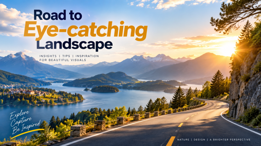
Road to Eye-Catching Landscape
A beautiful landscape is more than a collection of colors, buildings, trees, and open spaces. It is a visual experience that creates a feeling, communicates an idea, and captures attention.
Whether you are designing a landscape photograph, travel banner, social media post, website hero section, or promotional artwork, the right combination of composition, color, lighting, and detail can transform an ordinary scene into an eye-catching landscape.
What Makes a Landscape Eye-Catching?
An effective landscape design usually has one clear visual focus. The viewer should immediately understand where to look and what makes the scene interesting.
Strong landscapes often combine several important elements:
- Balanced composition
- Attractive color combinations
- Natural or dramatic lighting
- Strong foreground and background
- Clear visual hierarchy
- Interesting textures and details
- Appropriate use of negative space
The goal is not to add everything into one design. The goal is to make every element serve a purpose.
1. Start With a Strong Composition
Composition is the foundation of an eye-catching landscape. Before adding effects, text, or decorative elements, decide how the main subjects will be arranged.
The rule of thirds is one useful approach. Imagine your image divided into nine equal sections using two horizontal and two vertical lines. Positioning important elements near these lines can create a more balanced composition.
Leading lines can also guide the viewer’s eyes through the scene. Roads, rivers, buildings, bridges, fences, and pathways can naturally direct attention toward the main subject.
2. Use Color With Purpose
Color can completely change the mood of a landscape.
Warm colors such as yellow, orange, and red can create feelings of energy, warmth, and excitement. Cool colors such as blue and green can create a calmer and more natural atmosphere.
A good landscape does not necessarily need many colors. A controlled palette can often produce a cleaner and more professional result.
For graphic design projects, choose colors that also support the brand or message. This becomes especially important when the landscape is being used as a marketing background.
3. Make Lighting Work for You
Lighting is one of the strongest tools for creating visual impact.
Early morning and late afternoon light can create soft shadows and warm highlights. Strong directional light can add depth and make architectural or natural elements more dramatic.
When editing a landscape, avoid making the lighting look unnatural. Adjust brightness, contrast, highlights, and shadows carefully so that the final image still feels believable.
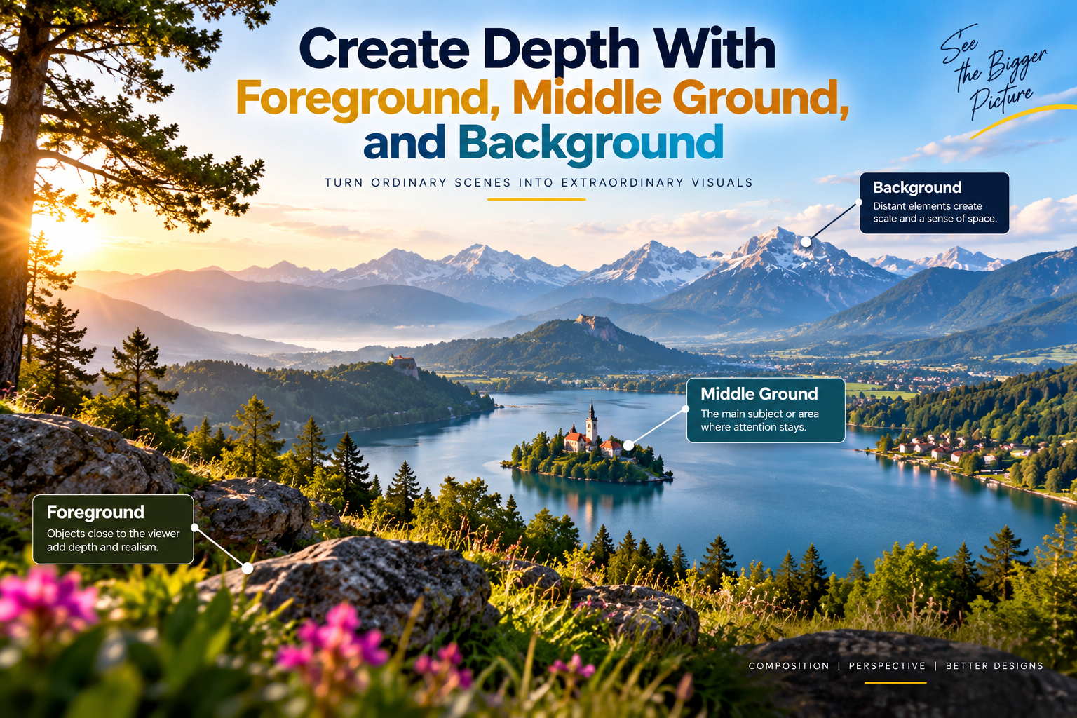
4. Create Depth With Foreground, Middle Ground, and Background
Flat images can sometimes feel less engaging because everything appears to exist on the same visual plane.
A simple way to create depth is to divide the landscape into three layers:
Foreground:
Objects close to the viewer, such as plants, roads, rocks, vehicles, or architectural details.
Middle Ground:
The main subject or area where the viewer’s attention should remain.
Background:
Mountains, buildings, sky, distant roads, or other environmental elements.
Combining these layers gives the viewer a stronger sense of space.
5. Keep the Main Subject Clear
One common mistake is making every part of a landscape equally important.
Instead, choose one primary subject. It could be a building, mountain, road, person, vehicle, product, or city skyline.
Use contrast, lighting, scale, positioning, or color to make that subject stand out.
If text is being added to the landscape, leave enough negative space around the text so it remains readable without covering important visual elements.
6. Use Negative Space
Negative space is the empty or less detailed area surrounding the main subject.
The sky is often an excellent example of negative space in landscape design. A clean sky can provide enough room for a headline, logo, or promotional message.
Instead of filling every area with graphics, allow the composition to breathe. This can make the design look cleaner and more premium.
7. Add Details Without Creating Clutter
Small details can make a landscape more interesting. Textures, shadows, reflections, clouds, vegetation, architectural features, and atmospheric elements can add realism.
However, too many details can make the design confusing.
A useful principle is simple:
Add details that support the story. Remove details that distract from it.
8. Consider the Final Platform
An eye-catching landscape should be designed according to where it will be used.
For example:
- Instagram: Square or vertical compositions work well.
- Website hero: Wide landscape compositions are usually more suitable.
- YouTube thumbnail: Strong subject placement and readable text are important.
- Print brochure: Higher resolution and proper print dimensions are required.
- Social media advertisement: The main message should remain visible even on smaller screens.
The same landscape may need different crops for different platforms.
9. Use Typography Carefully
When a landscape is used as a promotional graphic, typography becomes part of the visual composition.
Choose fonts that match the subject and maintain strong contrast between the text and background.
A simple hierarchy can include:
Main Headline
Large and attention-grabbing.
Supporting Text
Smaller information that explains the message.
Call to Action
A short instruction such as “Explore Now,” “Discover More,” or “Get Started.”
Avoid using too many font styles in one design. Consistency makes the final composition easier to understand.
10. Balance Creativity With Simplicity
An eye-catching landscape does not need excessive effects.
Gradients, glows, overlays, shadows, filters, and other effects should be used carefully. When every element is highly edited, the design can lose its natural character.
Strong design usually comes from making deliberate choices rather than adding more elements.
The Road to a Better Landscape Design
Creating an attractive landscape is a process. Start with the composition, establish the focal point, build depth, control the colors, refine the lighting, and then add supporting details.
Before finishing, step away from the design and look at it again. Ask yourself:
- What do I notice first?
- Is the main subject clear?
- Is the text easy to read?
- Do the colors work together?
- Does the image have enough depth?
- Is anything distracting from the main message?
These simple questions can help identify problems before the final design is published.
Final Thoughts
The road to an eye-catching landscape begins with a strong visual idea and ends with careful execution. Composition, lighting, color, depth, typography, and negative space all work together to create a memorable visual.
Whether you are creating a landscape photograph or a professional marketing graphic, focus on clarity first. Once the foundation is strong, creative details can take the design to the next level.
Great landscape design is not about adding more. It is about making every visual element matter.